Quad Fund embodies optimism and empowerment, celebrating ambition and the joy of learning. With bold, dynamic energy, it inspires confidence in young students, making education feel exciting, accessible, and full of possibility.

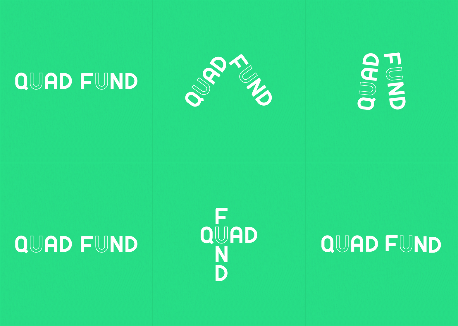
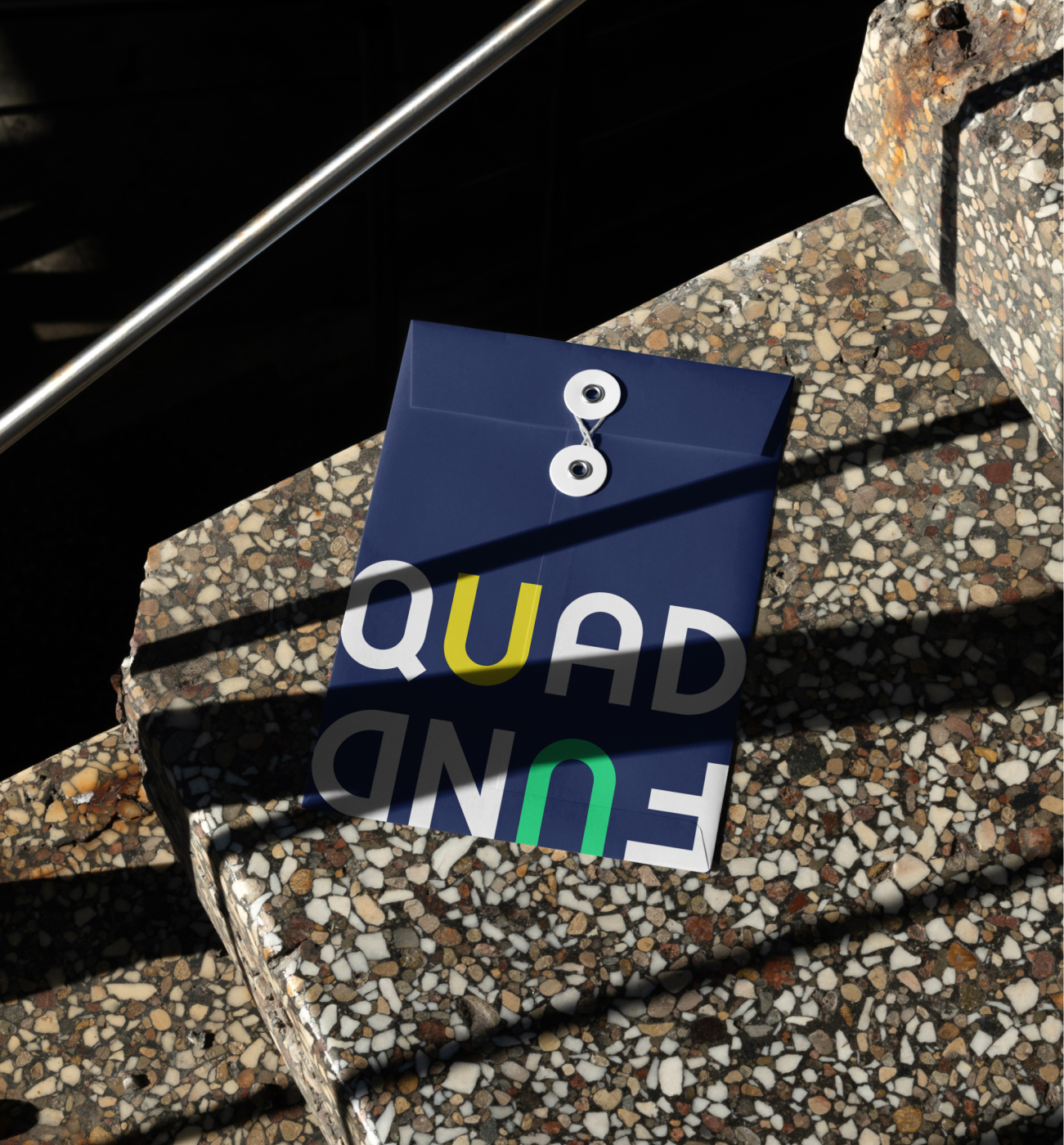
The Quad Fund logo starts with bold geometric typography, experimenting with dynamic layouts to create a playful and engaging identity.
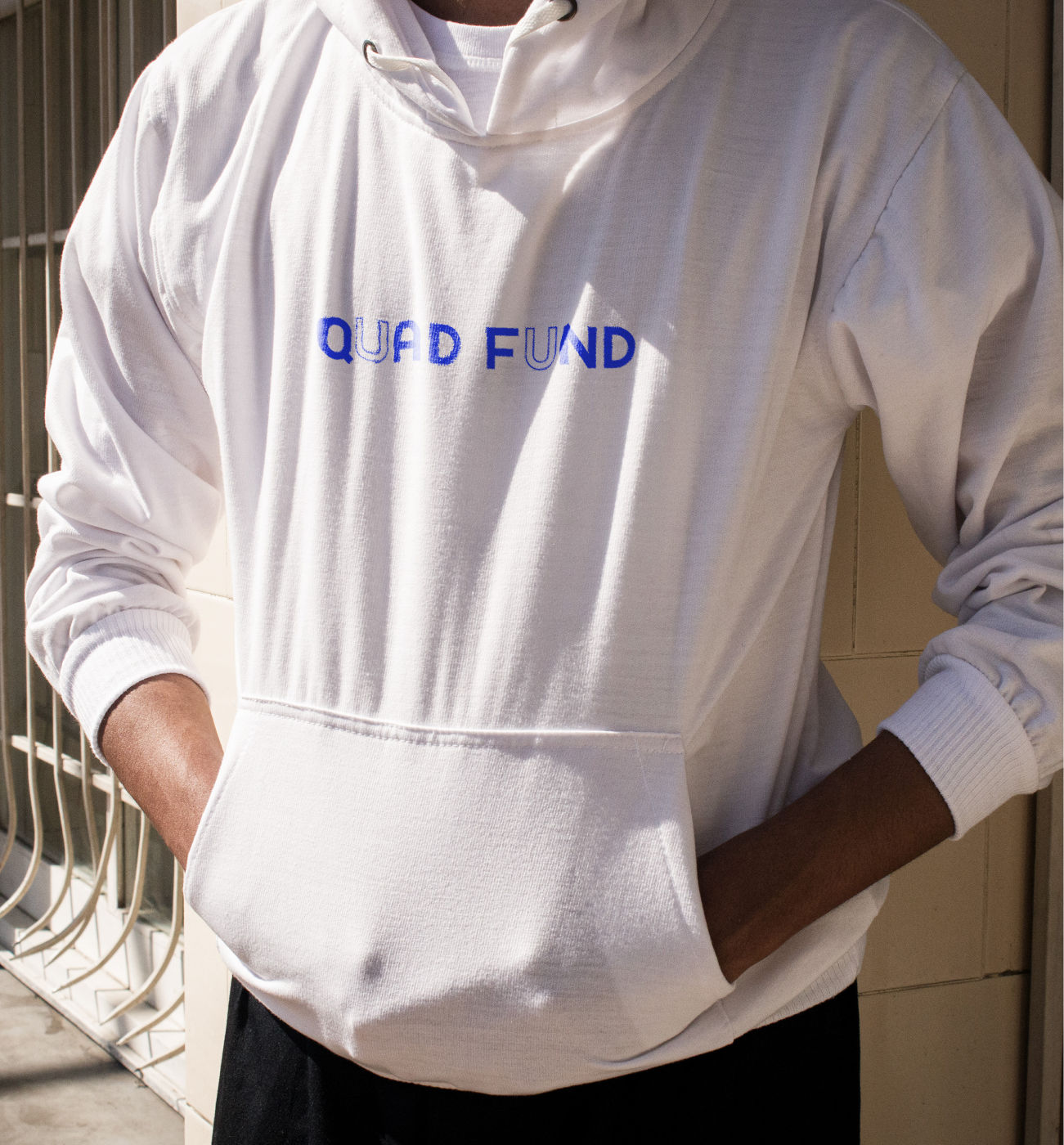
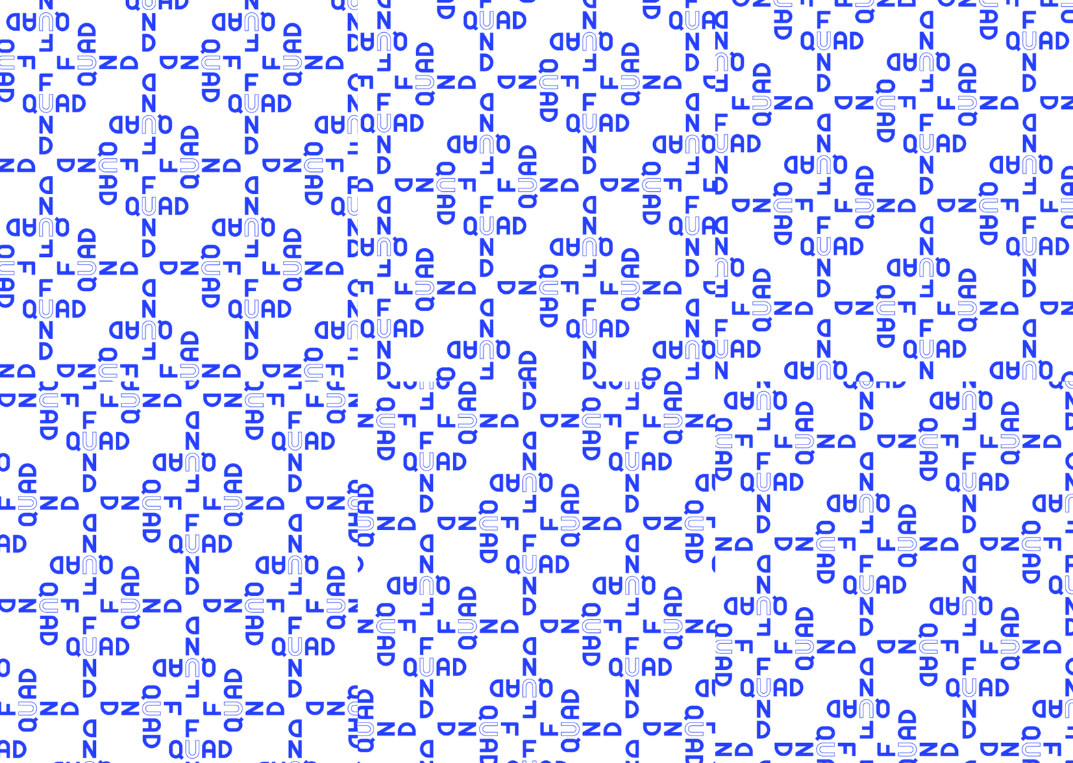
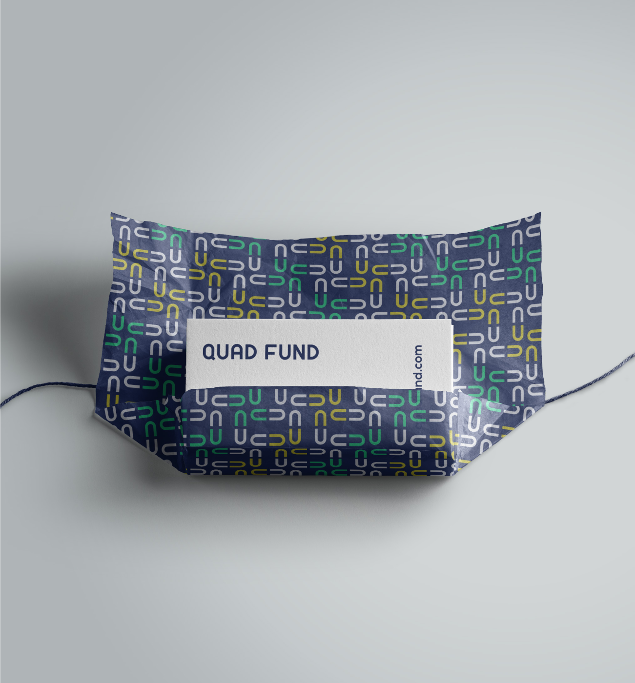
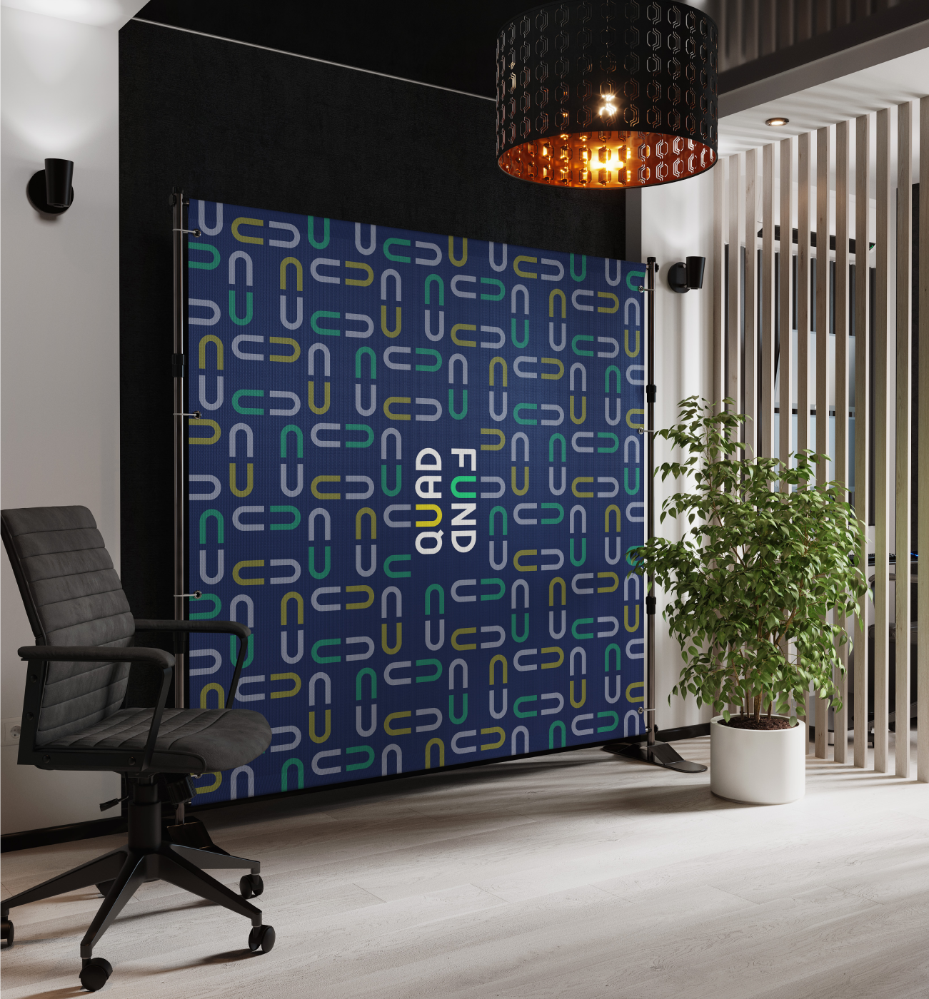
The Quad Fund logo transforms the letter "U" into a geometric abstraction, forming four identical figures arranged in a square to symbolize unity and the four siblings. This isotype lays the foundation for playful patterns and graphic elements, reinforcing the brand’s energetic, dynamic, and educational spirit.

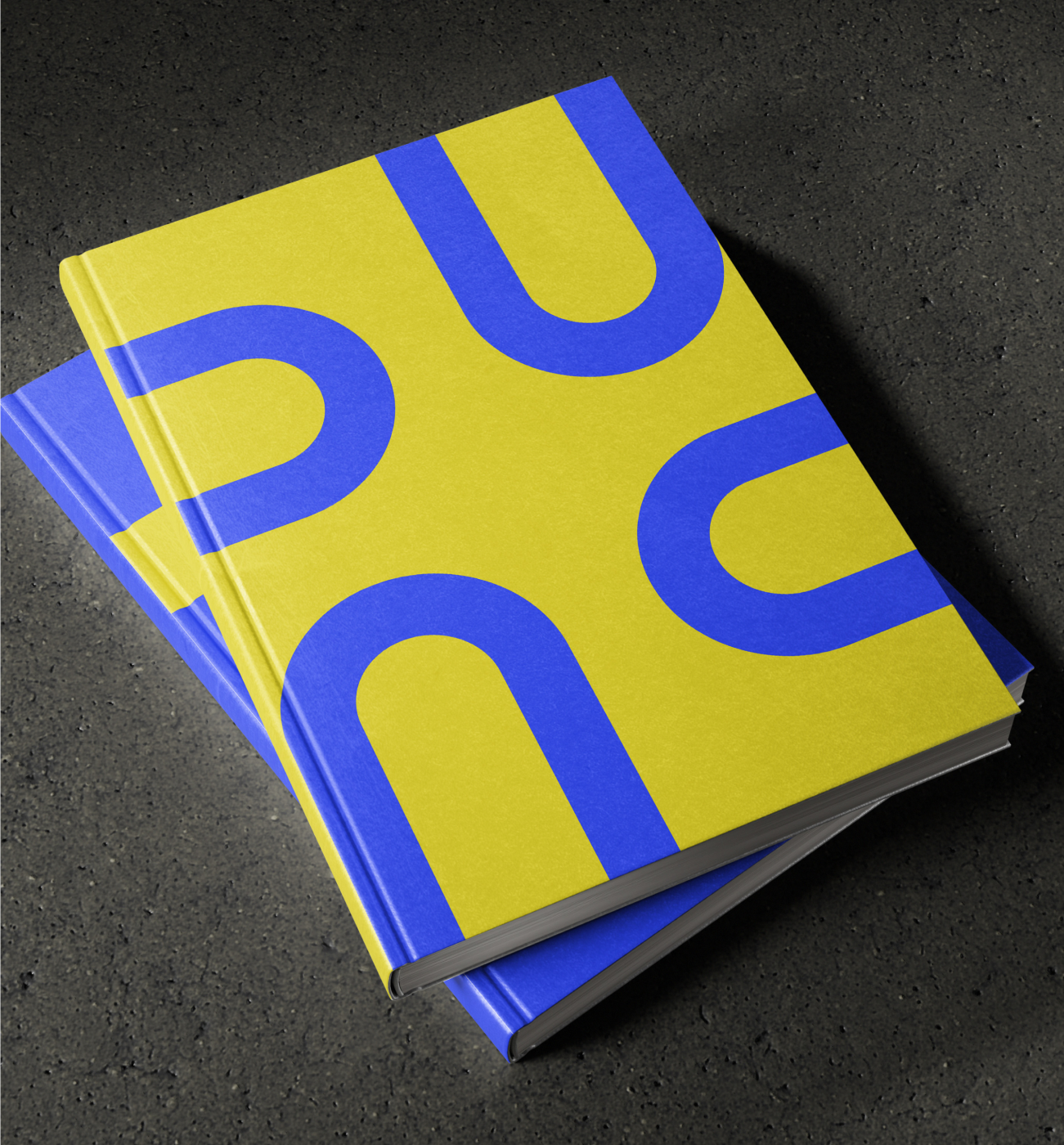

The brand’s bold energy is reflected in a vibrant color palette, combining contrasting hues and dynamic tones to inspire potential students. For formal applications, the palette includes slight tone variations to maintain a professional yet youthful feel.

Bright colors are applied to photography, adding an experimental and adventurous layer to the brand’s aesthetic. This vibrant use of color enhances visual storytelling, bringing energy and a playful edge to the imagery while reinforcing the brand’s dynamic character.
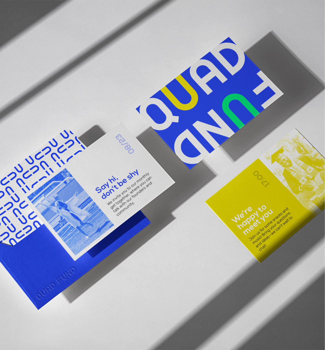

The brand’s bold energy is reflected in a vibrant color palette, combining contrasting hues and dynamic tones to inspire potential students. For formal applications, the palette includes slight tone variations to maintain a professional yet youthful feel.
